C-208A, M3M Urbana, Sec-67, Gurugram, HR-122101 (INDIA)
About US
Atulayam Designs is a young and focussed Interior Design Studio committed to deliver top-quality interior design services with exceptional artistry and unwavering dedication to excellence.
READ MORE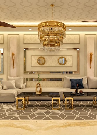
Complete Guide to Choosing the Right Color Combination for Your Home (2026 Edition)
It’s about creating a feeling, flow, and harmony across your entire home.

In this guide, you’ll learn:
- How to choose the right color combination (step-by-step)
- Which colors make your home look bigger and more luxurious
- Common mistakes to avoid (very important)
- Expert frameworks used by designers
- Real-life examples you can apply instantly
How to Choose the Right Color Combination for Your Home
Why Color Can Make or Break Your Home
Imagine walking into your home after a long day…
The space either feels calming, luxurious, and “just right”—or it feels dull, cluttered, and slightly uncomfortable.
That difference?
It’s not your furniture.
It’s not your budget.
👉 It’s your color combination.
Most homeowners underestimate this. They pick colors based on what looks good in a catalog or paint shop, but once applied, the same colors feel completely different.
Because choosing colors isn’t about liking a shade.

Choosing the perfect color palette is both science and art.
It involves:
- Color psychology
- Lighting conditions
- Room size
- Furniture tones
- Lifestyle needs
The Simple Formula Designers Use
:
✔ Start with a base color
✔ Add complementary shades
✔ Use accent colors for depth
This creates a space that feels:
- Balanced
- Spacious
- Visually premium
Step-by-Step Process (Beginner to Expert Level)
1. Start with a Neutral Base
Neutral colors are the foundation of luxury interiors.
Best base colors:
- White
- Beige
- Soft grey
- Cream
👉 Why this works:
- Makes rooms look bigger
- Works with any furniture
- Creates a timeless feel
Example:
A Gurugram apartment with beige walls instantly feels warmer and more inviting compared to plain white.
2. Add 1–2 Complementary Colors
This is where personality comes in.
Popular combinations:
- Grey + Navy Blue
- Beige + Olive Green
- White + Charcoal
👉 These combinations create contrast without chaos.
3. Use Accent Colors for Depth

Accent colors = luxury factor.
Use them in:
- Cushions
- Curtains
- Artwork
- Decor pieces
Best accent tones:
- Gold
- Emerald green
- Deep blue
- Terracotta
👉 Even 10% accent can transform the entire room.
4. Consider Lighting (Most Ignored Factor)
Same color = completely different look in different lighting.
Natural Light:
- Makes colors appear brighter and truer
Artificial Light:
- Warm light → yellow/orange tones
- Cool light → bluish tones
👉 Always test colors at different times of the day.

5. Match with Furniture & Materials
Your walls don’t exist alone.
They must match:
- Sofa color
- Flooring (wood/marble)
- Curtains
- Decor
Example:
- Wooden flooring + beige walls + olive accents = warm luxury
- Marble flooring + white walls + gold accents = modern luxury
Which Colors Make a Home Look Bigger and Luxurious?
If your goal is a premium, spacious home, focus on this:
Colors That Make Spaces Look Bigger
- White
- Cream
- Light grey
- Pastels
👉 These reflect light and open up the space visually.
Colors That Add Luxury
Combine neutrals with rich tones:
- Navy blue
- Emerald green
- Burgundy
- Gold accents
👉 This layering creates depth without making the room feel heavy.
Real-Life Example
A small 3BHK in Gurugram:
❌ Dark brown walls → cramped feel
✅ Light grey walls + navy accents → premium & spacious

Struggling to Pick the Right Colors? You’re Not Alone
Let’s be honest…
Most homeowners face this:
- Colors look good in showroom but not at home
- Walls don’t match furniture
- Space feels dull or too loud
👉 That happens because color selection is often random.
How Designers Choose Perfect Color Combinations (Expert Framework)
The 60-30-10 Rule (Must Follow)

This is the backbone of professional design.
- 60% Dominant Color → Walls
- 30% Secondary Color → Furniture
- 10% Accent Color → Decor
👉 This creates visual balance automatically.
Room-Wise Color Strategy
Living Room
- Warm & inviting tones
- Beige, soft grey, muted greens

Bedroom
- Calm & relaxing
- Pastels, light blues, soft neutrals

Kitchen
- Clean & fresh
- White, light grey, subtle contrast

Texture & Materials Matter
Color isn’t just paint.
It changes based on:

- Wood texture
- Marble finish
- Fabric type
👉 Same color looks different on:
- Matte wall
- Glossy surface
- Wooden panel

Common Color Mistakes Homeowners Make
Avoid these if you want a premium look:
❌ Choosing from tiny samples
❌ Ignoring lighting
❌ Using too many colors
❌ Overusing dark shades
❌ Not matching furniture
What Happens If You Get It Wrong?
- Home feels smaller
- Looks cluttered
- Feels uncomfortable
- Expensive but not premium
Designer Color Planning vs Random Selection


How Atulayam Designs Helps You Get It Right
Instead of trial & error, we follow a structured process:
1. Understand Your Style
Modern / Luxury / Minimal / Classic
2. Analyze Your Space
Lighting, layout, room size
3. Apply Color Psychology
Mood-based color selection
4. Create a Balanced Palette
Whole-home color planning
5. Match Materials & Furniture
Everything works together
6. Final Visualization
So you see results before execution
Benefits of Choosing the Right Color Combination
✔ Makes your home look bigger
✔ Creates a luxury feel
✔ Improves mood & comfort
✔ Enhances furniture & decor
✔ Increases property value
✔ Gives a professionally designed look

Why Homeowners in Gurugram Prefer Expert Color Planning
Homes in Gurugram are modern, premium, and fast-paced.
That means:
- Limited space optimization matters
- Luxury aesthetics matter
- Cohesive design matters
👉 A well-planned color scheme can increase perceived home value significantly.
Final Thoughts: Don’t Just Pick Colors — Design an Experience
Anyone can choose a color.
But creating a home that feels
- Calm
- Luxurious
- Balanced
- Timeless
👉 That requires planning.
Because your home is not just a space —
It's your daily experience.

Frequently Asked Questions (FAQs)
1. How do I choose the best color combination for my home?
Start with neutral tones, add complementary colors, and consider lighting, furniture, and room size.
2. Which color is best for luxury interiors?
Neutral shades with rich accents like navy, gold, and emerald create a premium look.
3. Do dark colors make a room look smaller?
Yes, unless balanced properly with lighting and lighter tones.
4. Should all rooms have the same color theme?
Not identical, but they should follow a consistent palette for harmony.
5. Do I need a designer for color selection?
If you want a premium, mistake-free result—absolutely yes.
Ready to Transform Your Home?
Don’t leave your home design to guesswork.
👉 Get a personalized color plan that matches your space, lifestyle, and vision.
📞 Contact Atulayam Designs: 08448773139
Leave Your Comment